Resources
How to Build a Landing Page

Lets talk landing pages. We learned a few tips from the pro’s that when read cause ‘palm to strike forehead’ and a sudden “Of Course!” to escape the lips.
Link-Ratio :
The purpose of your landing page is singular or at least it should be.
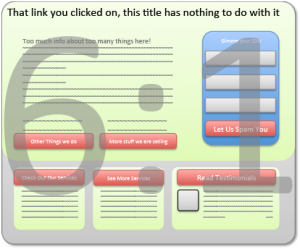
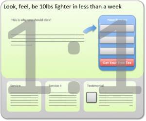
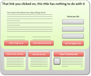
If you are sending people from an advertisement to your homepage or have littered your landing page with link options, then your visitors are likely paralyzed by choice. The spell of your advertisement is broken and your conversion drops as your audience’s attention is lost. This is where link-ratio comes in. 1:1 = ideal. They have already clicked on your ad now give them what you promised and keep it simple so they don’t get distracted.
Link-Language?
Ad: Lose 10lbs in 5 days… Title: Buy our supplements they are great!
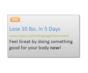
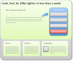
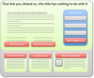
Conversation is how we are used to communicating. It seems only natural then to link what you are saying in your advertisement to what you are saying in your landing page.
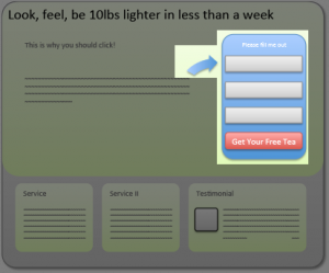
Ad: Lose 10lbs in 5 days… Title: Look, feel, be 10lbs lighter in less than a week
Subtitle: Our supplements not only help you lose weight, they are great for you.
Here again we are helping our visitors who have by necessity developed super short attention spans. Set the stage for coherence with conversational flow from ad → title → content → call-to-action.
Good Trade?
So there is a form on your landing page. You want something. Email address, phone number, something. What will you give me for my personal information? You’ve set the stage with your ad and content, now your call-to-action will need to be a good trade or I ain’t click’n.
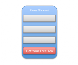
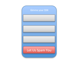
Remember they are already on your landing page, they want to click, don’t blow it now. Give me something good; a white paper, free webinar ticket, a piece of candy, something!
Design Tools!
We’ll keep this simple and start with 3 tools that will make a measurable difference.
1) Help your visitor follow the flow of your page and find the form and call-to-action by using direction cues. Think arrows, pictures of people pointing lines flowing in that direction… High school art class stuff, very basic yet wonderfully effective.
2) Colors (yikes) big topic, but basic tip. Choose contrasting colors, there are loads of free web tools to help you mix and match. With properly contrasting colors you will be able to create clear breaks in your page making it easy for your visitors to consume each bit of information as they are ready for it. This also comes in handy when selecting the all important call-to-action button color; bright, but not too bright.
3) Mark your form territory. That is to say find a nice way to make it clear that this here is my form for you to fill out, see how easy and clear it is?
