Resources
Fixture Care Case Study: An App for Healthcare Facilities


Let’s say you own a business.
Make it whatever you want: tech, food, beauty, clothes. The important thing is that you own a business, and you’ve outsourced some of your necessary needs to other companies – you found a company to market, a company to build your website, and a company to create an app for you that elevates your business to the next level. Your business is growing.
How much of that external stuff – your marketing images, your website, your app – do you own?
If you are not sure, then chances are you do not own it, and even if you are sure you might want to double check. Ownership can be tricky. You might have limited permissions to use something ‘as if’ you own it, but where does that leave you when you want to make alterations or change vendors?
Sadly, it is a common practice in the IT industry for a developer or development company to retain ownership of the apps and software you pay them to build for you, in addition with control of the accounts it depends on.
This is dangerous, and it’s one of things that goes against our own policies. We believe that our client partners should retain ownership of everything: the accounts we use are in their names, the apps and software we build are theirs to use as they please with or without us, and we even provide technical documentation specifically designed to make it easy for another developer or team to step in as needed.
However, that was the situation that our client found themselves in.
They owned the product, a tracking system that monitored plumbing in medical facilities.
They didn’t own the code behind its app, or the systems it used. By the time we came along, the client had far outgrown what their original developers’ app could deliver, and they needed a change.
The brief
Adapt and improve on the existing app to make it more efficient, and user-friendly.
The challenge

The existing app was fraught with issues, not meeting expectations, and they didn’t own the rights to its use.
The work

One of the things we needed to understand before taking on the project was how this app fit into their overall business. We wanted to understand what they wanted out of this iteration of the app and how it was going to change in the future. Through detailed discussions with the client, we learned that they were interested in adding additional apps in the future. Through some careful thinking and research, we were able to consolidate all three apps into one and create a seamless user experience that simplified a very difficult process into a clear format.
By combining all three of their suggested apps into one, we also managed to save them a significant amount of money, not just in the upfront costs of creating the app, but also for maintenance and support.
The App

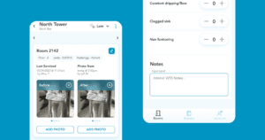
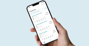
The mobile app is accessible by admins, technicians, and clients (with site based permissions). While each user group has different roles assigned, the primary structure remains the same – but by adding or hiding controls based on the user group, we could use the same set of pages to deliver a purpose-focused user experience for all the groups.
Lessons Learned
Communicating with the client is essential in understanding why certain choices have been made the way they have been: you might find that you can help foster a better solution than the client had in mind, particularly in industries where they might not fully understand the capabilities of what apps can do.
Do you have an app in mind but you’re not sure how much you can do with it? Want to really push the limits of your app’s capabilities? Talk to us – we’re always interested in helping people push their businesses higher!